Death to the Sidebar
Posted on December 27, 2012
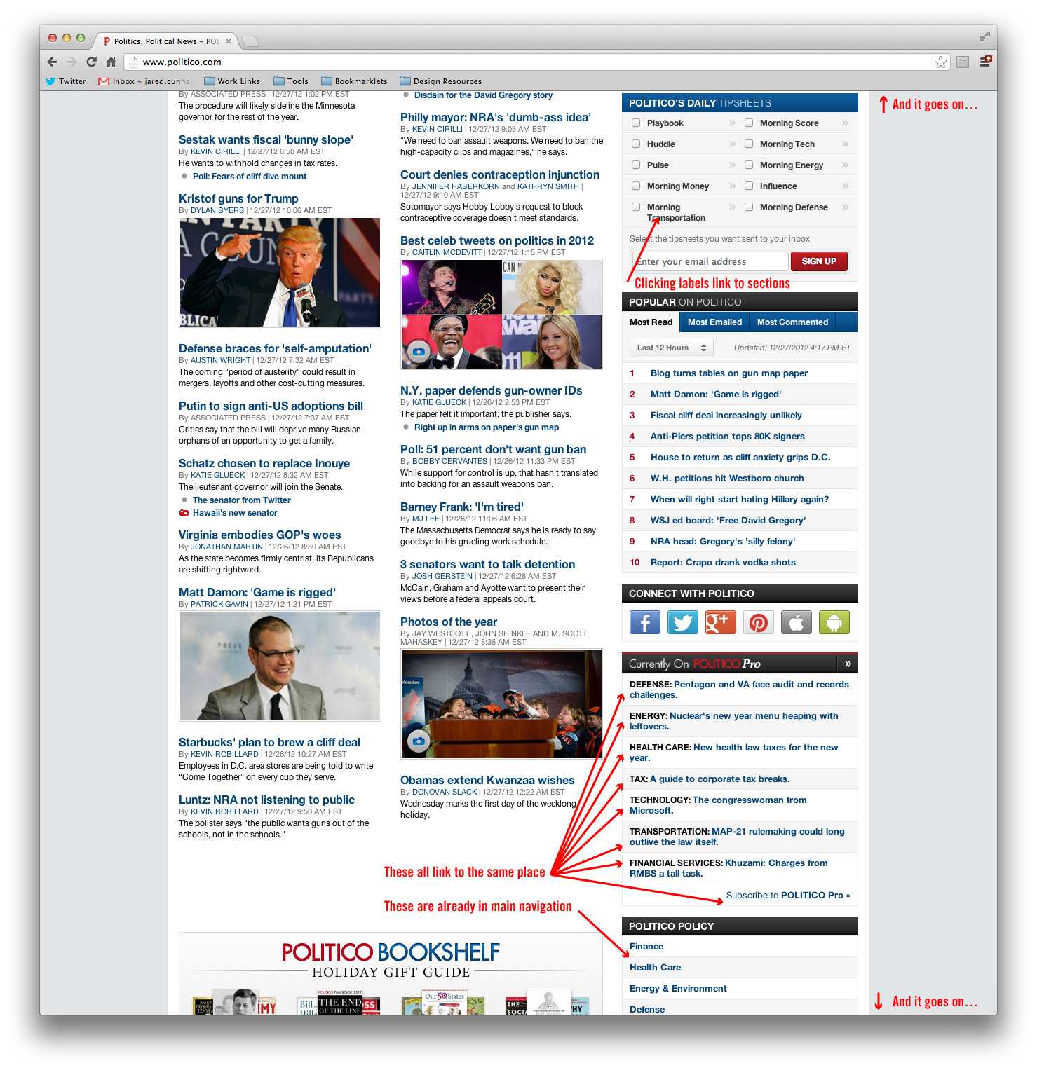
You know the layout I’m talking about – the two column layout with the main content on side and large stack of widgets in the sidebar. Yeah, that sidebar! The distracting bucket of useless bric-a-brac! It has often seemed as obligatory as the main navigation bar or the footer because that’s where you put all that other stuff. I’m not writing this post as a blanket condemnation, but I believe its days as a standard for news sites (at least) might be numbered. We’ll likely see a number of sites redesign in 2013. Many will adopt a responsive design strategy that I hope will move designers away from instinctively using this convention as a default.
Topmost items in those sidebars may have some value. If there’s a box ad at top, we can assume that the advertiser paid a little extra for the prominence. There might even be a widget or two that garners a heavy amount of click-through and does have real priority over some items in the main content area. But this only holds true when the viewport is capable of displaying the two columns side-by-side. That prioritization is lost on mobile devices where the sidebar collapses underneath the main content, and the ancillary material within it.
And this is good news!
If responsive design has done one thing remarkably well, it has forced us into structuring our websites the way they are supposed to be structured; aligning the priorities of both visual display and markup. With that in mind, the sidebar is no longer a viable option because it cannot deliver on that need. But let’s also address the likelihood that the sidebar is mostly a wasteland of random and often redundant link lists, useless twitter feeds, social link tiles, and political real estate that nobody outside the company cares about. Each of these items slows the site’s performance, requires maintenance, and creates a visual distraction from the content.

So what’s the remedy? First, ask yourself this question: do these widgets add value to website? Are they useful to the reader? Will the fact that John C. in Ohio liked an article 8 days ago make it a must read? Why does @drunkballs’s Twitter mention of the magazine matter? Why would you ask someone to sign up for a newsletter they already receive? Will the ability to sort the most emailed article by hour, day, or week, help a user make an informed decision about what to read? Can you adequately answer these questions? If not, nix them!
For what remains, it’s important to make some considerations. Can the content be flexible? Will it contain sponsorships? What are the height/width thresholds? These constraints are important to hash out before proceeding with what will ultimately comprise of the site’s overall architecture.
Let’s look at some examples.

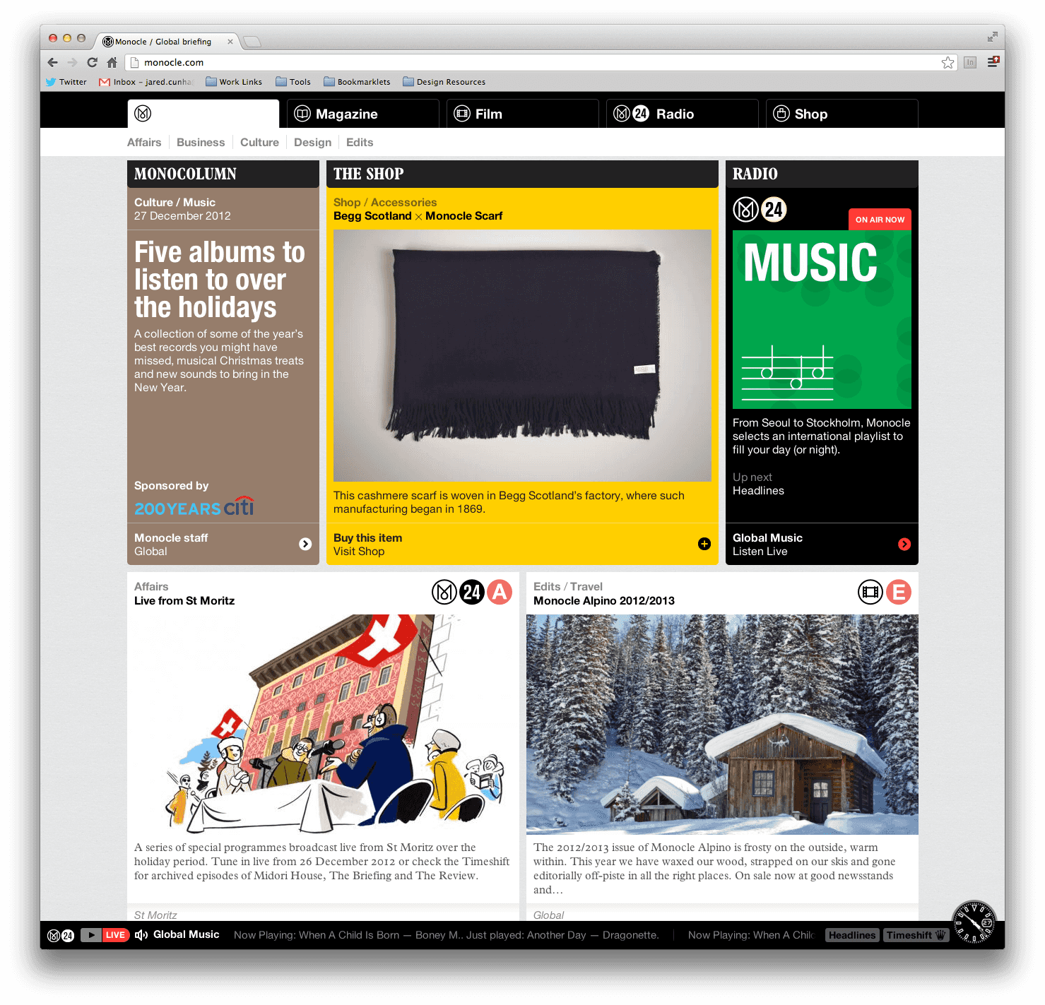
Monocole uses content modules of equal height, mixing promos and articles. The modules allow for a healthy amount of teaser text, compelling images, flags, tags, and categories. Let’s say they can be arranged into any number of rows and columns. This setup can be flexible enough to adapt to the ebbs and flows of a given news cycle. Did the NY Times just write a profile on your star reporter? Then you can easily bump his newsletter signup module up on the page while satisfying needs of desktop down to mobile.

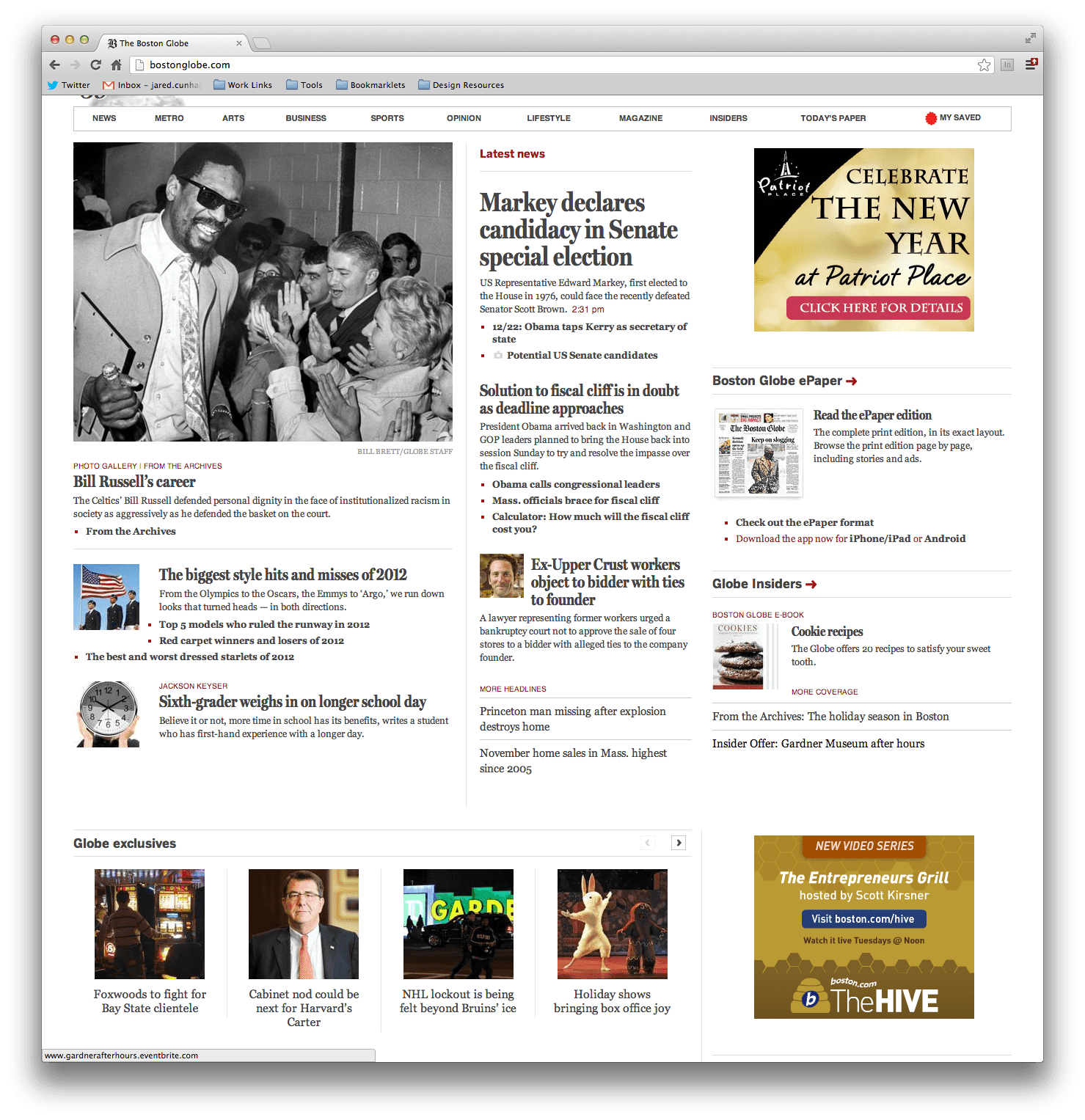
The Boston Globe was the first major news organization to go responsive. Rather than use a single row of main content + sidebar, they’ve broken it up into multiple rows. Like Monocle, this could be something arranged into any combination or rows and columns, but requires a bit more labor to maintain balance. While the layout has existed well before responsive design was a thing, it is still popular with news sites trying to mimic a more print-like experience on the web. Not only does it break the monotony as you scroll down the page, but it also provides modularity and helps keep content prioritization for mobile.

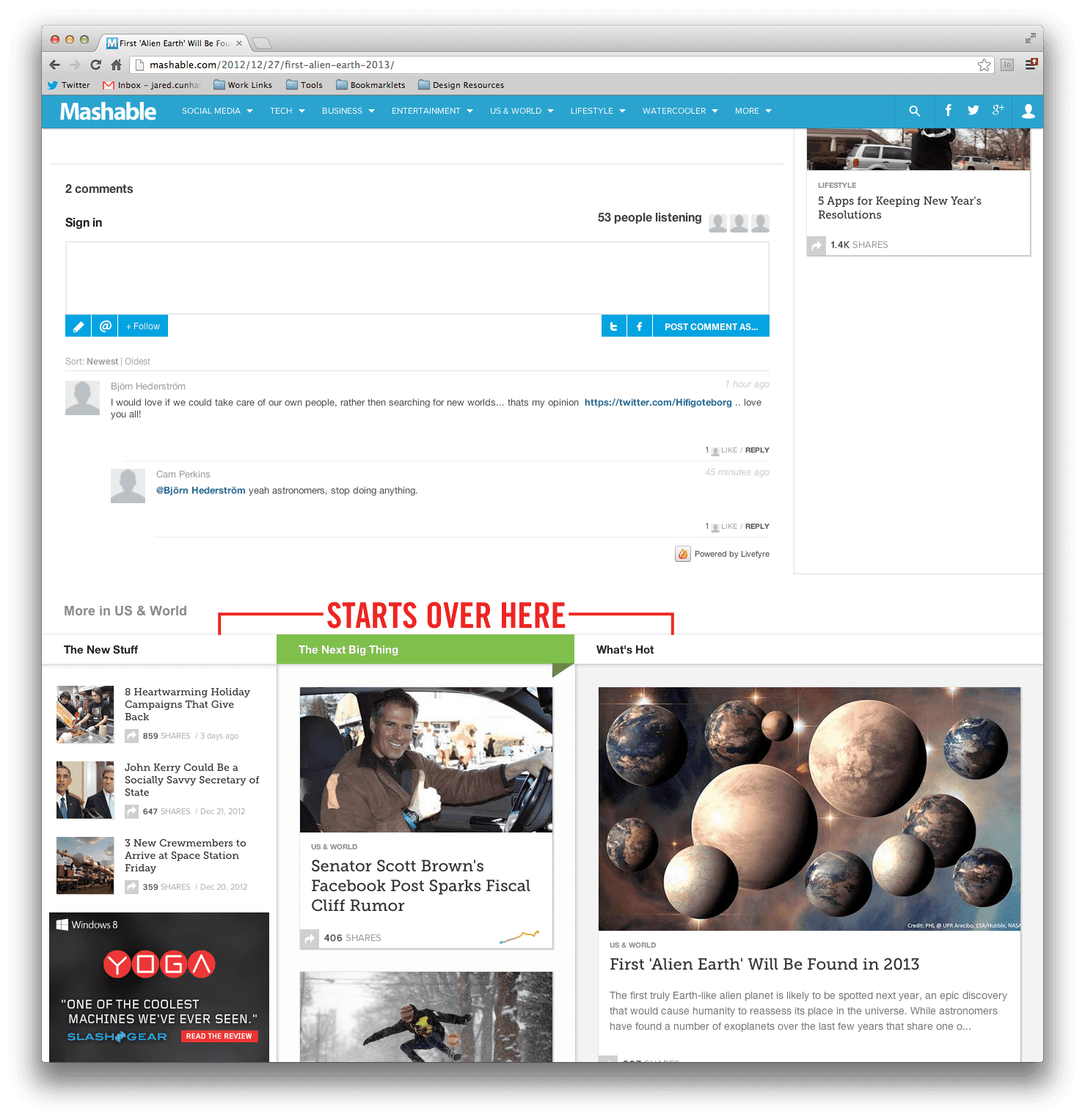
Mashable has done something quite remarkable with their article pages. As you scroll down to the bottom past the comments, it’s as if the homepage starts over and the infinite scroll continues onward. To the right of article there are still some links to other stories, but they’ve done it acceptably without going too far. News sites will often add sidebar widgets that act as a mini bucket for a content section. Mashable has eliminated any need for that through functionality rather than structure.
As you can see, there are plenty of ways at our disposal to help avoid the sidebar and widget abuse we’ve heaped upon our readers. There are other, and often better, ways to generate revenue than display ads. There are better ways to organize the content you couldn’t fit in the nav bar. There are betters ways to achieve what the sidebar was supposed to achieve, and user experience must be at the heart of it, not internal politicking.